Albumprinter
Interaction Design Guidelines & Patterns
Consultancy for Albumprinter, helping them to become more design-driven: research into the inconsistencies of their products, and a design pattern handbook to bring it in line.
From 2010 until the end of 2011, we worked together with Albumprinter to enhance their design insight and improve the interaction design and consistency of their various products. Historically, Albumprinter is a development-driven company. Therefore the transition towards becoming more design-driven doesn’t come naturally. Hence, we assisted them in their process of becoming more design aware and in creating an overall consistent interaction design.
Albumprinter, a leading company in the service of printing customized photo albums for their clients, have a wide range of products and services for a wide range of platforms and systems. And while they had a big development department, they lacked a design department and an overall design vision. They constantly measure their performance and conduct intensive quantitative research into usage, all this focused towards higher conversion and sales rates. When encountering problems with their products, their natural reaction is to provide stopgap solutions as quickly as possible. The result of all these ad-hoc fixes without a clear design direction is that over the years, their product portfolio had become a patchwork of all different styles and ways of doing things, with poor usability overall.
We researched and analysed a few of their workflows and the results were remarkable: there was a huge inconsistency in grids, workflows and element styles, naming and placement. And we found many variants of basic elements which should be the same in one product. It turned out they had been reinventing the same wheel over and over.
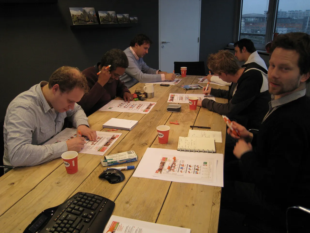
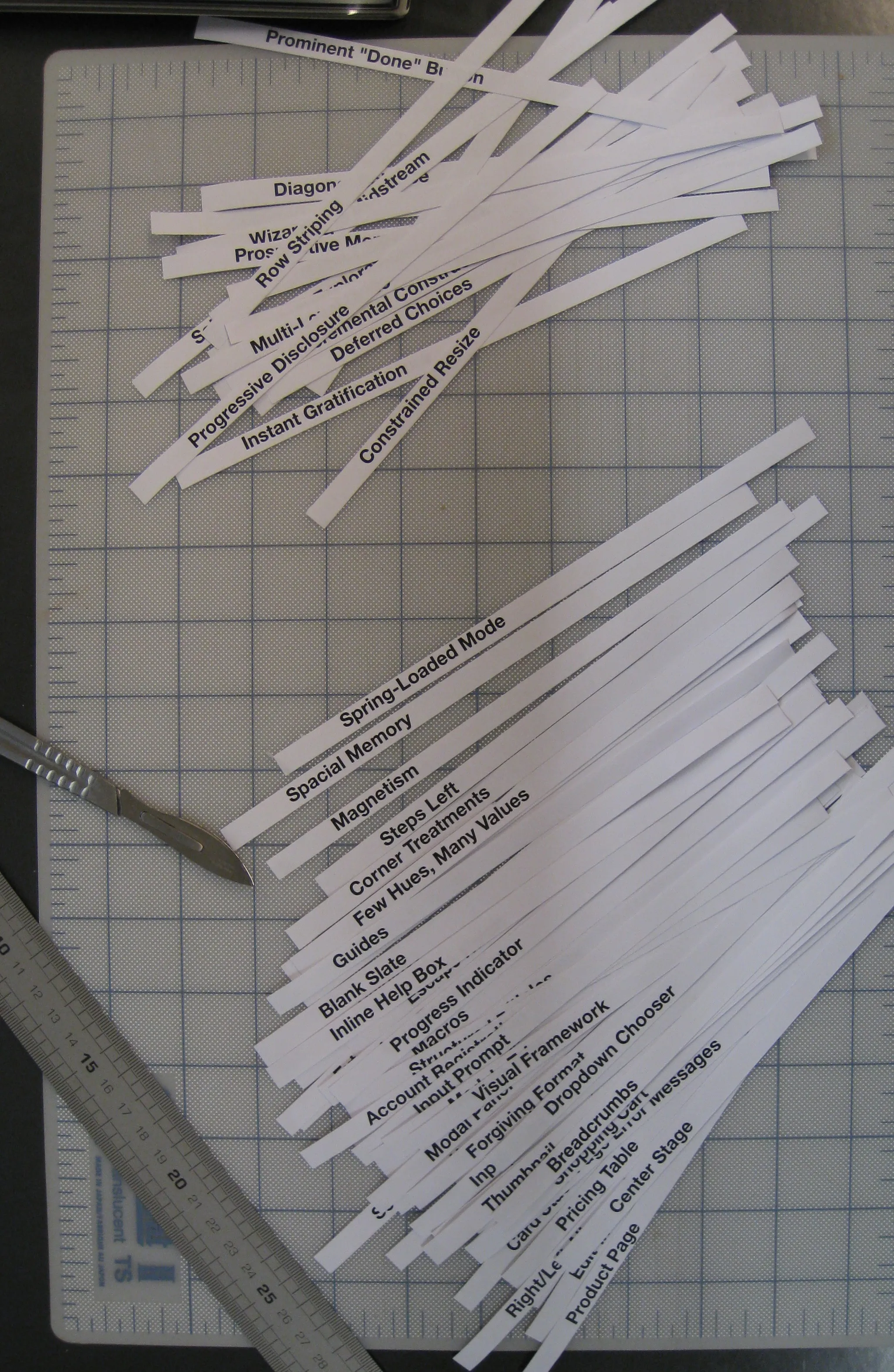
This inconsistency called for a pattern handbook, or as we call it Interaction Design Guidelines, which could be used throughout the whole organization to direct and streamline the interaction design and usability of their products. We made an outline and templates of how such an Interaction Design Guideline should look and work. Together with the client we then filled in the templates and compiled an exhaustive library of all the design patterns, components, elements and guidelines which they should be using. We delivered this framework and the guidelines to guard and assure the overall visual and usability consistency. Albumprinter then took this to design their products further.